 A typical end-of-the-day scene.
Wednesday, January 28, 2009
"You can't Miss"
I'm still a little mixed up on the blog assignments. The one I'm assigned to doesn't really seem like a blog...more like a newsletter. Here's the link if anyone has any answers for me. http://www.senecadesign.com/designgeek/dgarchives/designgeek55.php
Anyway, I came across this on the Creative Review blog. I thought it was interesting considering what we've talked about regarding design history, and what we will be talking about regarding portfolios. Check it out! http://creativereview.co.uk/crblog/a-designers-portfolio-16th-century-style/
The Winner of the first VOX cover competition
For my response this week, I wanted to comment on our first critique of the cover designs. We all survived! We're used to it though after going through magazine design, right? Although opinions of our covers were quite mixed and at times...disappointed...I think everyone had creative ideas, and it just goes to show how many different interpretations there are out there of the stories.
Kristin captured the story really well in her cover design. It was really simple and to the point...and everyone understood it! I liked the use of a cassette tape because when paired with the colors, typographies and textures, it adds to that vintage feel that I think of when I think of the Indie scene. I'm looking forward to seeing what it looks like tomorrow!
Plans for the week to come
The rest of this week and the weekend to come are going to be busy for me, as I assume it will be for quite a few other people.
I have the VOX cover for the 2.5 issue due tomorrow. Although I don't have any images to post for this yet (I'll post them next week), I'm really excited about this one. I think the spring preview feature design that Phillip and Sarah have been working on is really cute and captures the feeling and colors of spring in a new and creative way. I'm trying to follow their concepts and colors in my cover designs.
I'm also slated to design the Books department for the 2.5 issue. I'm looking forward to working and completing my first design of a department page of VOX.
I'm taking the newspaper design class and I'm designing features. I've enjoyed my time working on the design end at the Missourian, and my feature design will be running in the 2.2 paper. Take a look at it...it's about eggs!!
VOX Feature 2-29
My concept behind this design came from the headline "Faces of the Economy." I saw that as the literal faces (the men behind the desks) and the faces of my illustration. Everyone feels differently about this economic crisis...as depicted in this story. One man feels rather optimistic about the crisis and how our choices will impact the crisis, and another man sees the situation as more complex and an issue that will be harder to get through. I think the illustration represents the many different emotions of people regarding the current state of the economy. I think I'm going to stick with this concept for my redesign, but I need to perfect it so the entire design seems more unified.


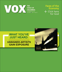
VOX cover 1-29
Here was my first attempt at a VOX cover. I really liked my idea, but I ran into the problem of people really understanding what it was. My idea was inspired by the CW television network. After an episode of your favorite guilty pleasure show (e.g. One Tree Hill), the CW tells the viewer what artists they just heard during the episode. I think I could have executed this concept better. There's just something missing. It could be the typography, the fact that it doesn't say "TV screen," etc. But for the redesign, I don't think I'm going to stick with this concept. I think if I added any more details to this design, it would get too much into simply copying the CW. I think I'm better off with coming up with a whole new concept. What do you think?
Subscribe to:
Posts (Atom)