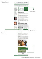
I've posted my idea for a logo and color palette for my website, and I've also posted what I was working on last week for the Missourian - a media kit for the Missourian's Neighborhood Newsletter. This includes a logo, a collage page of the different neighborhood logos, a screenshot page of the online newsletter and an example of an ad. Let me know what you think!


I really like how you incorporated the house icon into the logo. It frames and mimics the shape of the "N" in a surprisingly unexpected way and immediately gives the sense of community and, well...neighborhood. I also like the color palette you're working with (if you got to make that call).
ReplyDelete